Monday, March 15, 2010

Spring Training Records Matter, A Little

I thought I would take a look at whether spring training records matter or not. Clearly the teams are not playing to win. But, in the extreme, my guess is any MLB roster spring training effort is going to be much better than, say, a high school team's effort. An extreme example, but I was curious if spring records convey any predictive value to what is going to happen in the regular season.

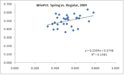
My answer is that they do, a little. Or, better put, they do some seasons. I looked at the latest 8 seasons (2002-09). In 5 of those seasons you had a positive correlation between spring training win percent and regular season. In three years you have very little or slightly negative correlations, but in the other 5 you have reasonably positive correlations.


So it is never a bad thing to have a good record. At worst it says nothing about your regular season, but other years it says you will probably have a decent season.


The trends in 2007-09 may just be random but it will be interesting to see what happens in 2010.


Another way too look at this is to group teams by their spring records and see what their average winning percentage was for the regular season:


x is the spring winning percentage (x axis) and the vertical is regular season winning percentage. So, if you had a .400 or worse winning percentage in the spring season of 2009, you are the left most column. So there is some correlation. There is wide variation, but still, a relationship. 2009 was a particularly strong correlation (.385). So for all 8 years:


Looks kind of similar to the 2009 numbers. Interesting that the teams that did very poorly (x<.400) generally do better than those that do less poorly (x<.450). I wonder if that is because the teams that know they are going to be bad try a bit harder to win games in spring training because they hope it will translate into some lift in the regular season vs. those that recognize that the games do not matter.


This is not to say that teams should try to win games. This analysis suggests, that even when teams are not trying to win games, but the players are trying to perform well, those outcomes convey a modest amount of information.


More charts:

All eight years in scatter form along with the three most recent seasons:


Friday, February 19, 2010

Playoff Odds vs. Spending Habits


The above chart groups franchises into groups of spending levels and looks at the playoff participation rates of each group.

The "High" is six teams (CHN, LAA, LAN, NYN, NYA, BOS). They got into this bucket by being in the top 25% of spending 60%+ of the time for years 2002-09 (latest 8 years). Teams like NYN, NYA and BOS were there every year, but some other teams would bounce in and out.

The "Medium" were below 60% but 25%+. 8 teams were in that group. "Low" was everyone else, especially my Padres.

The conclusion seems rather obvious to me. You can spend more, and do it consistently, you get to go to the playoffs. You are lucky enough to be a fan of the "High", you get to see your team in the playoffs once every other year (slightly more). Pretty exciting. You are in the mid group, it drops to about once every 5 years, or twice a decade. Hmmm, not quite as exciting. And if you're in the bottom group, it is once every six years, or twice in twelve years. Less exciting.

And, consider that the NY Mets are in the "High" group with one playoff appearance during 2002-09. As an aside, Omar should be canned ASAP. But, if you eliminated them from the high group, the playoff participation rate goes to 65%. And it would just leave BOS and NYA in the group being in the top 25% every year during the last 8 years. The playoff participation of that group of two is 81%.

Or another way to think about it is that if you are in the top group, you are 2.12x more likely to go to the playoffs than the mid group and 3.6x more likely than a team in the low group.

The answer to this is revenue sharing. Revenues need to be put into a common pool (while keeping profit incentive with the franchises) and let MLB and MLBPA duke it out over what % goes to players and what % stays with the teams. Some serious negotiations will have to occur between big and small market teams because the big market teams make more under the current system, but let them sort that out. This is roughly what the NFL does. This would eliminate market size as a variable of team success. Other variables will remain (FO talent, luck, etc) but at least this one outside of anyone's control will be eliminated.

Monday, February 15, 2010

Mets Suckitude


I like the Mets. This post is for my buddy Mark, hardcore Mets fan. Somehow, despite their spending, the Mets continue to miss the playoffs. The Philadelphia collapses, the injuries last year. Yes, I guess they can be explained, but the chart shows them as really the odd man out.

Data:
The vertical bars are the average number of times in 2002-09 (8 years) that the teams shown were in the top 25% of payroll. The Yankees, Boston and Mets were every year, so they have scores of 100% (or 1.0 average for each year). Chicago was in the top 25% 5 out of 8 times (63%).

The line is the number of times that team made the playoffs in those 8 years, or their annual playoff probability over those years. Nice clean correlation starting with CHN (Cubs) but the Mets are the outlier.

MLB Payroll


The data above (not all that well labeled) shows total MLB payroll (blue bars) vs. the correlation of each team's payroll to a calculated estimate of the DMA value for each franchise.

Being a Padres fan, I care a lot about the discrepancies in spending power across the MLB franchises. I wanted to post some work I did playing around with team payrolls.


Summary of data and methods:
Took team payroll data from the USA Today database: (http://content.usatoday.com/sports/baseball/totalpayroll.aspx?year=2009)
I organized them by year, and did some basic clean up (like creating an index: team salary / MLB average x 100).

I also had pulled down DMA information from the census. I basically took population numbers by DMA and HH income by DMA, creating a "pool of money" or DMA value (Income per HH x Population = value of DMA; yes I should have income person, but since I am being consistent across DMA's and just using it for relative value of DMA's, not absolute, I think it is OK).

So I trended the salaries, but also ran the correlations between the DMA value index (value of the DMA / average DMA value; this does not change) vs. the payroll index (listed above). I trended the correlation.

My findings were pretty striking. Starting around the mid-90s, payrolls really began to increase. What is interesting, is that the correlation between the DMA value and the franchise payroll strongly increased to almost .90. I interpret that with the steroids era, money really began to flow into MLB and suddenly the stakes got higher for winning, so the teams that could spend more started to do so, getting to the point where it is .90 correlation. I am sure there are others, but the relationship is very interesting.

Method stuff: For the teams that share a DMA (NYC, Chicago, LA, etc), I split the value of the DMA 50/50. I am guessing fine tuning that will not change the results very much.